
A few weeks ago, I decided to make a slide presentation to help explain the fairly complex vision of Datacosmos. I was tempted to buy Keynote for my mac, but wondered if there was some cooler web-based presentation software out there. After some searching I found Impress.js, a 3D presentation tool built in HTML, CSS, and Javascript. I fell in love.
Fortunately, I read the Source and found this helpful advice:
…if you want to build a great presentation take a pencil and piece of paper. And turn off the computer…
As it turns out, most slide presentations are terrible. A google search on “bad slide presentations” turns up some 30 million results. Guy Kawasaki and Steve Jobs have famously commented on the phenomenon. And dozens of books have been written about how to wow and annoy with slide presentations.
People hate bad slide presentations.
To hedge this possibility of sucking, I bought the book Presentation Zen and started reading. Here’s some stuff I learned:
Don’t
- Create an outline of your speech with your slides
- Have more than 6 words an any slide
- Use meaningless transition animations
- Read from the slides
Do
- Learn how to tell a story
- Use contrasts, e.g. Good/Bad, Old/New, Problem/Solution
- Stick to one idea per slide
- Use the slides to reinforce your words not repeat them
- Figure out the most important thing to convey, cut out everything else
- Keep the design simple
The big take-away is this: you’re not creating a slide presentation, you’re creating a compelling story. Think about your audience, study the great story tellers, and use your natural empathy to connect with people.
Knowing this doesn’t save you. People who understand the above take-away still make bad slides. One veteran public speaker has a few ideas why.
Two weeks attempting to hack out an effective presentation has led me to think that people don’t create compelling stories because: it’s damn difficult.
Crafting a story
In the beginning I did a lot of thinking, brainstorming, walking, and talking to myself. I came up with anecdotes, metaphors, jokes, and contrasts. I thought about the Big Picture. I thought about why people would care. As ideas came to me, I jotted them down on sticky notes and slapped them up on the whiteboard. Periodically, I thought about structure and rearranged the stickies.
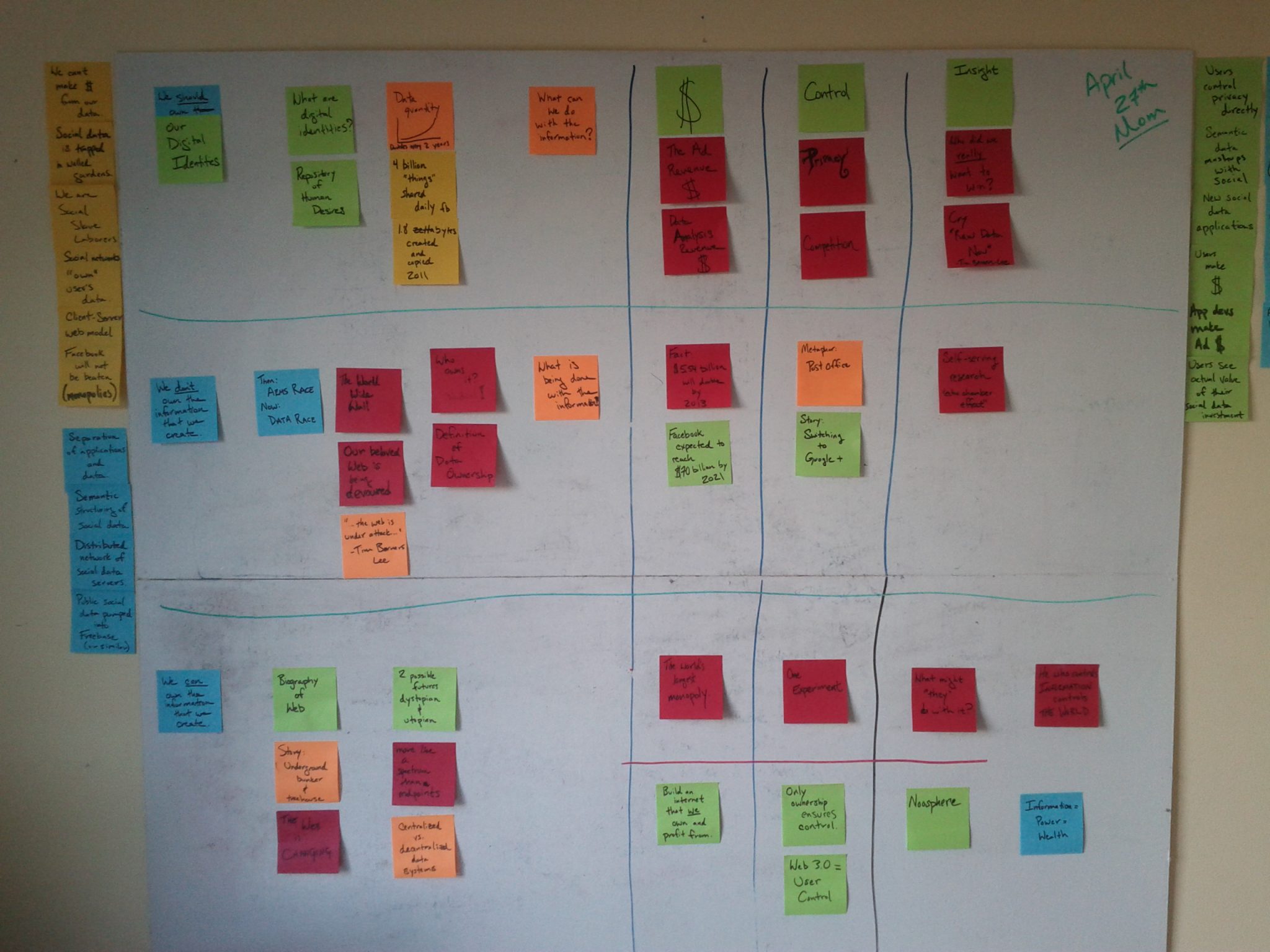
Then I’d get away from it: take the dog for a walk, cook something tasty, meditate.
Over time a clear flow began to develop. I had a lot to say, but I discovered an organization that made it seem like less to remember. It was a grid: for each of three rows I had three columns. The columns were the main ideas (Profit, Control, Insight), the rows were the contrasts (Past, Present, Future1, Future2).
I was excited that it was coming together so nicely. And (AND!) I discovered that the 3D presentation tools of Impress.js provided a really nifty way to navigate the grid, one that would make it easy for people to follow… hopefully.
Having settled on a presentation strategy, I started building the Impress.js.
Coding a Presentation
I won’t go into great detail about how to build an Impress.js presentation because they do such a good job of it in the html source of the demo you can download. If you are at all comfortable with HTML and CSS, you should be good.
Here’s how it works, though:
You position each “slide” or <div class=”step”> element in 3D space with tag attributes. So, if you wanted to place a slide way over to the left on the x-axis, but in the middle of the y-axis, you simply code:
<div id="first" class="step hide" data-x="-2000" data-y="0">
That’s not all, you can rotate elements around any axis as well as scale them:
<div class="step hide" data-rotate-y="90" data-scale="10">
The optional id attribute makes it easy to style each slide in css as well as jump to any particular slide by adding a descriptive id anchor to the url:
http://datacosmos.com/impress.js/stardust.html#first
The order of the div elements in your html determine the order of the slides. Hitting the right arrow advances the slides.
Handy Hack
Since all these slides occupy the same space that the viewport is gliding, rotating, and zooming throughout, sometimes you’ll see another slide from the one you’re currently on. If this adds meaning to the presentation, keep it. More likely you’ll find this overlap distracting and unnecessary.
You can either monkey with the positioning of each slide so this doesn’t ever happen, or add a hide class (as shown in the code example above) to the slides you want hidden when not active. Then add this css to your stylesheet:
/* fade out inactive slides */
.step:not(.active) { opacity: 0.3; }
.step.hide:not(.active) { opacity: 0; }
Voila! The previous slide fades out as the next one fades in.
Annoyance
As of this posting, impress.js still doesn’t work on an iPad.
Done is better than perfect
Deadlines are great for getting things done. The day before I had to give this presentation to my mentor it began to dawn on me that, even though my presentation had a lot of the right ingredients (logical symmetry, contrasts, humor, stories, metaphors), it was just way too long and it didn’t flow like a good story should.
But I stuck with the plan, filled in the remaining gaps, and went to go pitch it.
Here it is:
Digital Identities: Promise, Reality, Threat, and Hope
It’s just the presentation (no audio), so it’ll be vague at best. I plan to make improvements then do a screen capture with audio. Stay tuned.
Lessons Learned
As cool as Impress.js is, it’s not going to make or break your presentation. Unless you have a really cool 3D idea, or just love HTML and CSS, you’re probably better off using something lame like PowerPoint or Keynote.
Simplify means eliminate. I need to go back and chop stuff out, trim it down to a more digestible/memorable size. Stories aren’t grids.
Content and delivery are audience specific. My mentor thought it was a good vision speech, but he was expecting a VC-style pitch deck. I ended up spending more time describing business and technical specifics on the whiteboard after the presentation. Plus some jokes fell flat like diarrhea on pavement.
People love personal stories.
Where’s the beef? Shocker stats: get ’em, use ’em, blow peoples’ minds. Social Media Revolution videos have been so popular that they’ve remade it each year since 2009. Why? Shocker stats.
Damn, I feel like there were more lessons… guess I haven’t learned them yet.
Thank you for this post! I’m working on an impress presentation and I really appreciate the .hide hack. This a huge help for simplifying the presentation at points when the other steps may be a distraction. Additionally, I found it helpful to add the following css rule to the class .step when rotating over the y axis on an element with the .hide class
/* No overlap between rotating slides */
.step { -webkit-backface-visibility: hidden;
-moz-backface-visibility: hidden;
-ms-backface-visibility: hidden;}
Thanks for your post, help me to solve problem with hidden slides. Great !
It’s very cool bro. Thank’s a lot